Showing posts with label color throwdown. Show all posts

Monday, November 02, 2015

Color Throwdown 366

I just loved Danielle Flanders "quick birthday cards in a pinch" tutorial at the Weekly Scrapper. You can see the tut here.  I always seem to be making cards at the last minute so I decided to make a few of these myself.  I decided to use the latest  color throwdown challenge. 
I have to admit I never in a million years would have paired mint green with orange but it looks great!
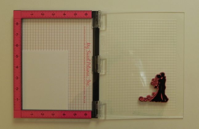
 The word celebrate is a free die cut file from Scrapbook and Cards Today.  "Its your" comes from Papertrey ink's Wonderful Words: Bithday Mini stamp set.  The word "birthday" comes from Papertrey Ink's Vintage Picnic stamp set.  I hand drew the exclamation points.   It's hard to tell in the photo but the stars are actually glittery.  I punch them out of white, colored with white wink of stella glitter brush maker and layered on top with glossy accents.  It really looks like a purchased embellishment in person.  I think the stars make this card a little more masculine then the sequins Daniel used.  I did one more card in mint green too.

A friend of mine gave me a bright paper pack to make some cards for her.  I tend to shy away from big bold colors but I figured this style of card would work well for this pack of bright colors so...


It was nice participating in a challenge again.  I look forward to doing more in the future!  Thanks for stopping by!  Please come back again!

Share:

Monday, July 06, 2015

Color Throwdown #349

Okay I missed the deadline for the latest color throwdown challenge.  It's not that I didn't have the card done I just didn't realize the  deadline was 6 PM!  Oh well I am going to share my creation  with you anyway.

This card is very similar to the one I posted yesterday....click here in case you missed it.    I remember seeing  Laura Bassen's awesome rainbow card using this very same Papertrey Ink Text Block:  Birthday die that I used but with a wonderful rainbow background.  You can see Laura's amazing card here.   She cut two cover plates one white and the other rainbow.  She pieced the rainbow pieces around the white lettering.  I really liked the way this looks.  So I thought I'd give it a try...ending up with two cards with minimal effort.  Boy was I wrong!  Laura must oodles of patience!  There are a ton of pieces to save in that background!  I tried using the dryer sheet method as seen in this video to contain all the pieces which helped some but it truly was a pain piecing everything back in.  I glued the worded frame down first then went through the process of adding the colored background in but I had to move my words around a bit to get all the pieces to fit in.  It probably would have been better to scotch tape everything together and then glue the whole completed frame down.   So I bow down to Laura and will probably never try this again!

Thanks for looking!  Please come by again!


Share:

Sunday, July 05, 2015

Papertrey ink Make it Monday #216

This weeks Make it Monday video over at Papertrey Ink involves adding color to cover plates.  Check out the great video by Laura Bassen here!

I only have one cover plate die.  I bought the PTI's Text Block:  Birthday die.  I had yet to use it so it was fun to have an excuse to get it out.

I got the color scheme from the latest Color Throwdown challenge.  (I have another card that showcases these colors better so I'll share that card tomorrow.)  I decided to use MIM # 204 Watercolor Smooshing to add color to the cover plate.  I have always wanted to try this technique and it actually was quite fun!  I used watercolor paper to prevent a lot of warping.  I thought these colors reminded me of the beach so I made some "waves" using PTI's scallop die from the Nostalgic Notions kit.  I was going for a masculine looking card so I forced myself not to add any more embellishments.  All in all I think it turned out pretty well since I am terrible at masculine cards.

Thanks for looking!  Please come back again!

Share:

Sunday, June 07, 2015

Color Throwdown #345 Sending Prayers

Do you struggle with sympathy cards?  I definitely do.   It's so important to get the right look to these card.  So when I saw THIS wonderful card by Nerina I instantly bookmarked it.   Her card is perfectly elegant...I couldn't wait to make my own version!

I decided to use Color Throwdown's newest challenge colors. 


When I think of red and green colors together I think of Christmas so I was  careful not to pick any flower that resembled a poinsettia when completing my card.

I used Papertrey Ink's Harvest Berries for the focal element of the card.  Just as Nerina did I embossed the darker vines.  The red flower is from PTI's honey bees and the sentiment is from PTI's beautiful butterflies

Thanks for stopping by!  Please come back again!

Share:

Thursday, April 30, 2015

PTI Make it Monday #210 and Color Throwdown 340

Lizzie Jones posted a wonderful video for the latest Make it Monday challenge for Papertrey Ink.  It involves using vellum to soften vibrant patterns.  You can check out the video here

I got my color scheme from the latest Color Throwdown #340.  I just love this color combo.  It makes me eager to plant flowers and fully embrace Spring!

Maile Belles did a wonderful card using PTI's Beautiful Butterflies you can see it here.   I just knew it would be the perfect background for this challenge.

I marvel at Maile's talent!  I had her card to use for placement of the butterflies but I still had problems developing a free flowing pattern.  I didn't have any small hearts so I used the asterisk type flower from PTI's Honey Bees to fill in the spaces.  I used PTI's Fillable Frame #5 die as my vellum accent.  I embossed in black a sentiment from PTI's Think Big Favorites #2.  Some asterick type stitching (used my sew easy) in pink finishes off the card.  Oh and I don't have the stamp layer to add decorations to the butterflies so I just hand did the accents using Copics.

Thanks for stopping by!  Please come again!  Enjoy your weekend!

Share:

Sunday, March 15, 2015

Color Throwdown #333 Anniversary Card

Howdy! Goodness it's been way to long since I've posted! So here I am to prove I haven't fallen off of the face of the earth! I have to use electric heat to heat up my craft room which is on the third floor of our house. It can get quite frigid up there and quite costly to heat! So now that it is finally getting warmer out I will be able to craft more which means you'll see me post more!

 I decided to participate in the latest Color Throwdown challenge #333.

 Aren't the colors just gorgeous!  Perfect for the anniversary card I needed to make.  Quite some time ago I had purchased Papertrey Ink's Guidelines Two stamp set.  I figured it would be perfect for stamping my own patterned paper to use for color challenges.  However, I found it very difficult to stamp the grid and get it lined up correctly.  I also didn't care for the grid being part of the pattern.  Misti to the rescue!  What is Misti you may ask?!  It is a stamping tool that becomes a replacement for acrylic blocks.  It helps you line up stamped images so precisely that you can stamp in the same spot twice without any shadow.  I can't really describe how amazing this tool is in words...so...here is what it looks like:


(Photo credit goes to Lisa Babitz
https://iplayedwithpapertoday.wordpress.com/2014/11/18/misti/)

And you can see videos of how it works on the inventor's blog  here.   I have only had the Misti for about a week but I truly believe Iliana is  genius!  I have always struggled getting stamps on straight especially sentiments.  I also don't always get a good impression with my first try but with the Misti it's easy to ink up and restamp in the exact same spot.  I could go on and on about this tool.  It is amazing!  It is expensive but so worth it!  I highly recommend purchasing the grid paper and the magnets if you order this though. 

Here is my card:

The background was all stamped using the Misti and I actually did 4 identical stamped panels so you will be seeing this stamped paper again in the future.  (Another benefit of the Misti..makes it super easy to mass produce duplicate projects).  I stamped the grid lines on transparency sheet several time and just taped them together until I got a grid large enough.  I positioned the transparency in the "L" of the Misti and hinged it with a piece of tape.  Making it easy to move out of the way for stamping.  Hard to explain.  If you are interested I'll take a few photos to show you how I did this just leave a comment to let me know. 

Thanks for stopping by!  Enjoy your week!  Please come by again!


Share:

Thursday, January 30, 2014

Card A Day Blog: Thank You, Color Throwdown #277 and Case this Sketch #61

Hello!  I am here!  Just haven't had as a much a chance to create as I did last week.  I was thankful it is my turn to design for Card A Day blog this week.  Ha..I didn't even realize I said thankful in the last sentence...kinda fitting since the theme this week is Thank You cards.   I'm sad to say I don't send these type of cards very often.  I must make more of an effort to do so in the future.

So once again I sought out challenges to point me in the right direction when starting this card.  First the wonderfully romantic color scheme came from Color Throwdown latest challenge #277.

I found this paper in my stash that basically contained all the colors in the challenge although the blue is a little different but they say substitutes are okay.  Next I sought out the latest Case This Sketch #61

I absolutely loved the white tree in the photo so I used my Stampin' Up Season of Friendship stamp and heat embossed it plus the leaves in white.  I placed the tree behind a rolling hill.  I freehand cut the hill and added a slight texture to it using a Stampin' Up texture plate. I added some punched flowers with pearl centers to the tree/hill some baker's twine finished off the hill.  Oh and the sentiment stamp came from Papertrey Ink's everyday classics anniversary set.   A friend of mine gave me that ruffled trim...I keep pulling it out to try to use on cards but it never looked right..but this time I think the ruffle is a perfect accent..what do you think?

Thanks for stopping by.  Please come back again!

Share:

Saturday, January 11, 2014

Color Throwdown and Mojo Monday Challenge

Yikes!  Has it really been since the beginning of November since I posted?!  I'm sooo sorry about that!  The end of the year just flew by not only because of dealing with birthdays and Christmas but we also did some painting too.  I can't believe 2014 is actually here!!  One of my resolutions this year is to definitely blog more.  So...to encourage me to blog more I have decided to try and participate in lots of challenges.  Not only does this spruce up my mojo but also challenges have deadlines for entry and so I must blog to meet those deadlines.  So wish me luck!  I hope you all do well with your New Year resolutions too.

Okay so I decided to make a card combining two challenges.  I love it when others choose color combos.  I have found soo many amazing combos when looking at color combo challenges.  This time was no exception...I never would have put these colors together on my own but they really do look great together!
 Find more info about the color throwdown challenge here.  There is still time to enter! 

So I had my color combo but I mentioned another challenge.  I sought out Mojo Monday's latest sketch to figure out where to place my elements.  You can find more info about this challenge here.

I fell in love with Wanda Cullen's example.  You can see her elegant card here.  Isn't that sentiment terrific.  I found it on Pinterest but it doesn't give a website.  You can find the printable sentiment here.  I copied it into word and printed 4 to a page so I can make similar cards quickly.  Aren't those butterflies adorable!  I just love the pearl beads on the body.  They actually are made using my KNK cutter and my 3-D butterflies file.  (Psst...I'm opening up a new store soon so these will be available there shortly).
Here is a close up.  Simply lay the one butterfly down flat then layer the embellished one on top with a little foam pop tape just in the middle and bend the wings forward a bit.  Instant depth!


I stamped the background with a Filagree Stamping up stamp using a Memento ink a shade darker than my cardstock.  The trim was from a bag I got at the Good Will store. 

The kids are in bed and it is so peaceful and quiet here!  Time to chill..watch some Dexter (a show we just started watching..but I feeling we're going to be hooked!) and snuggle with my hubby!  I will be back tomorrow with another challenge card post!  Please come back and visit me!

Enjoy the rest of your weekend!


Share:

Thursday, September 26, 2013

Color Throwdown #261

I needed a quick card for a good friend who is going through a rough patch lately.  Papertrey ink had a blog hop yesterday.  The theme was wreaths so I used a wreath.  But drat I wasn't able to post yesterday so I missed the hop.  I also looked to Color Throwdown for their latest color scheme.  Just love these blues mixed withe yellow and green!

I pulled out Papertrey Ink's Guide lines two and stamped the background.  This is the perfect stamp set for color challenges.  It was fun watching the patterned paper take shape.  I definitely will be using these again.

Supplies:
Papertrey Ink Stamps:  Guide lines two, Turning a New Leaf, Honey Bees, Mehndi Medallion Mini,  Sentiment: Fiskars??
Momento Ink:  Bahama Blue, Cantaloupe, Danube Blue, Bamboo Leaves
Ribbon and small pearls

Thanks for stopping by!  Have a great Friday!  Please come by again!


Share:

Sunday, September 22, 2013

Color Throwdown #260

I needed a quick sympathy and didn't have to time fuss with designing a card from scratch.  So I decided to case one of my own cards which was originally cased by a wonderful card by Betsy Veldman.  You can find it here.  For the color scheme I turned to Color Throwdown's latest color challenge.  I just love the mint green instead of the darker green traditionally used in Fall color schemes.


Stamps:  (All Papertrey ink) Rosie Posie-Background Basics:  Spots and Dots-Everyday Classics (Anniversary Set)
Ink:  (Momento) Tangelo and Sweet Plum, (Papertrey ink) Aqua Mist

Thanks everyone for your lovely comments about my husband's heart attack!  I so appreciate your support!  He is doing well and we are getting accustomed to healthier eating habits.  Now if we can just get our fridge fixed so we have someone to store our food!

Enjoy the rest of your weekend!  Thanks for stopping by!  Please come back again!
Share:

Saturday, August 24, 2013

Card A Day blog post: Milestone Birthdays and Color Throw Down

Hi!
I'm excited to tell you I have become a designer for Card A Day blog.  In case you don't know what that is it's a website where various designers post one card each day based on the assigned theme.  There is sooo much inspiration and challenges too.  You've got to check it out Here!  Oh but before you leave please take a peek at what I created first!

The theme this week is Milestone Birthdays.  So...I checked out my birthday list and as luck would have it I have a cousin who is turning 16 next month.  I can't believe she is that old...I remember her as a little baby..where has time gone?

This cousin as a child was very rambunctious and didn't sit still for a minute...so when I thought of her images of a bouncy/ dangling 16 popped into my head.  Weird I know but I ran with the idea and I think it looks wonderfully whimsical.  So I started with my Card Base 4 file.  Than dangled the number 16 from my Number Charms file using baker's twine.

It's hard to tell in the photo but I turned my paper number charms into acrylic glitter charms using my turning paper into metal technique.  You can find the tut here.  I cut the number out of plain white paper then covered with a layer of stickles.  Let dry.  Layered on many coats of UTEE then when the last coat of UTEE was still hot I sprinkled on some ultra fine glitter and heated it a little more.  Once cool you have a super sparkly faux acrylic charm! (Bonus..glitter is sealed in the UTEE so it doesn't flake off)   Trust me this photo just doesn't do the glitter justice..it shines in real life!  I can't wait to try this with different colors of glitter!

I got the gorgeous color scheme from the current Color Throwdown Challenge


Aren't those colors just gorgeous!  I just love color challenges takes the guess work out of where to begin.  Stamps also make it easy to abide by the color scheme.  I used Papertrey Ink's Background Basics:  Chevron Stripes Stamp set to make my chevron paper strips.  I just love chevrons!  Can't wait to try them in masculine colors!  Flowers and gems finish up the card.

My store is closing soon and I'm not sure when I'll have my files into a new store (please follow my blog to keep up to date on my whereabouts)  so cash in now at the best prices I have ever offered by going shopping here before it's too late!

Thanks for stopping by!  I hope you'll come back again!  Have a wonderful weekend!
Share: