Tuesday, July 26, 2016

SAF: Farewell

The festivities of Stamp-a-faire have come to an end.  I only got to participate in 5 of the 9 techniques.  The good news is the videos are there waiting for me when I have a chance to play again!  Gotta love that!  In fact by clicking HERE you can see technique videos not only from SAF this year but from past years. 

As a fitting goodbye I am sharing a photo of all the projects I made for this SAF.  It's sad that it is over.  But frankly my desk can't take any more crafting without a clean up first.  I did fairly well at putting away stamp sets as I went this time but I always end up with what looks like a ticker tape parade on the floor when I'm finished!

I do apologize for the barrage of posts in one night.. as I'm sure you are well aware I don't normally post that often.  But the deadline for entering the challenges is 7am on the 26th so I figured I'd rather create and then upload everything when I'm done.  Now I can go to sleep!

Thanks for stopping by!  Please come back again!


Share:

Monday, July 25, 2016

SAF 2016: Pointillism Play with Heather Nichols

Next up I believe is one of my favorite techniques.  It involved mimicking pointillism artwork.  This means artwork comprised of dots of color to make an image.  Heather taught us how to color a outline image using the end of a pencil eraser and some dot stamps.  I loved this!  There is something so carefree and fun about using dots to color in an image instead of the precise coloring normally involved used with Copics or colored pencils to color.  It really is amazing how the image starts to take shape the more dots you add.  You really can get a lot of dimension with this type of stamping.

I only have a handful of outline type stamps.  This is the only one I have that is large enough for this technique.  So thus I used the Peonies on Parade stamp set.  I used Momento Lulu lavendar, PTI amethyst allure and PTI plum pudding for my purples.  I used PTI spring moss and Momento Pistachio for the leaves.  PTI lemon tart and bright buttercup make up the center of the flower.  The sentiment is from Graceful Greetings II.  Everyone kept telling me how great the graceful greetings I stamp set was but I was still on the fence.  So when the second installment came out and I saw they had a sympathy and a get well sentiment I decided to jump on in.  I am glad I did and now the Graceful Greetings I is on my wish list!  I guess I can only run beside the bandwagon for so long before getting aboard!  I added the border from the no longer available PTI Nostalgic notions kit to the side but I felt I needed a darker purple element yet.  I didn't want to do sequins or any frilly ribbon since this is a sympathy card so I opted to color the border in with a Copic marker.    I was quite pleased with he way this looks and will have to remember to do it more in the future.

Thanks for stopping by!  Please come back again!


Share:

SAF 2016: Masterpiece Inspirations with the Team

The next SAF challenge I participated in involved the design team each choosing a particular piece of artwork that inspired them to create a card similar to that piece.  I decided to mimic a beautiful card by Danielle Flanders.  In fact I decided to copy it outright..why mess with perfection right!?!


You can see Danielle's card better on her blog here. I used the brushed blooms stamp set and the exact colors Danielle did but for some reason I had a hard time blending out that Americana ink..it looked really brown so I kept adding more and more pale peony until I got it mostly blended so as you can see below my card is much darker.

I struggled a little with the background too.  I am not good at free form artistic strokes so I played around with this for a while adding ink...water...ink until I got this which looked acceptable to me!  I used a sentiment from Keep It Simple:  Encouragement because I wanted to send it to a friend who is undergoing surgery this week. 

Thanks for stopping by!  Please come back again!

Share:

SAF 2016: Gilded in Gold with Danielle Flanders

My next SAF project involved using Liquid Leaf as Danielle Flanders showed us in her video.  I love this stuff!  If you haven't tried it before I urge you to get some...you won't be disappointed!  I never used gold much before but after using liquid leaf I certainly will use it more in the future.  You brush it on and it dries almost instantly leaving behind a shiny but not brassy gold finish.  This stuff is amazing!  Now it does have a rather unpleasant order similar to spray paint so you may want to open some windows when using it.  Okay enough gabbing I'm sure you want to see this stuff in action on my card now.  Oh and in case you missed it you can see the card I did for the blog hop which also uses the liquid leaf here.

I used PTI's tag sale #10 cut out of pale peony cardstock.  I cut the scallop part of the tag out of PTI's coasters then applied the liquid leaf to them.  I love Danielle's tip of using these coasters.  They cut really well and accept the gold well.  They are super thick too about the thickness of stacking 3 cardstock die cuts together.  They are super cheap too you get 25 for only $1.00.  The flowers and sentiment are from the stamp-a-faire exclusive set Art with Heart.  I just love that flower cluster! I added dots of the liquid leaf using my stylus to the flower centers.   I got the color scheme from beautiful card Kay Miller did.  You can see it here.  I added a soft swirl of ink to enhance my sentiment using the Clarity stencil brushes and some aqua mist ink.  Some iridescent sequins and much neglected fibers finishes off this tag.  Now I just have to make a gift to go with it!

Thanks for stopping by!  Please come back again!


Share:

SAF: Starry Night with Amy Sheffer

The next challenge I got to participate in was the one where Amy Sheffer shows us how to create our very own starry night masterpiece using inks and paint. 

Amy makes everything look so effortless in the video but I did struggle a bit.  I am pretty happy with the way my starry sky background turned out but I did have some harsh lines from the foam ink blending tool that didn't go away when I added water.  I definitely want to try this process again using my beloved clarity stencil brushes.  My trees turned out horrible!  In the future I will draw these in with a black marker.  I also had trouble with the thread nest.  Couldn't get that darn thing to wind off the spool nicely.  I ended up wrapping it around the acrylic paint bottle to try and get a semi-circular shape.  Don't you just love those sequins!  I have a wonderful PTI forum friend to thank for those jewels!  I used PTI's Inspired by Faith stamps and dies.

Thanks for looking!  Please come back again!


Share:

Stamp-a-Faire 2016: Master Color Recipes

I'm soo excited finally Papertrey Ink's annual Stamp-a-faire event is finally here (and gone).  It's a great event where the design team members post videos of various techniques.  We make something showcasing their techniques and we get a chance to win a prize.  This year the event focuses on mimicking the look of famous master artists.  The event ends at 7am tomorrow but the wonderful technique videos will remain on Nicole's blog.  Check them out HERE!

The first challenge involved mimicking a color scheme from a famous artists painting.  A download was providing for us to choose from. 

I chose this gorgeous colorful painting called "Date in the Park" by Leonid Afremov.  I was anxious to ink of PTI's anniversary set called Painted Petals for my card.  I remember loving a card from Betsy Veldman showcasing this set so I decided to copy it.  You can see her stunning card here

I used PTI's Modern Background Stencils in the middle of the card using Clarity Stencil brushes (linked in previous post).  The brushes allowed me to add a thin layer of soft ink overtop of the stenciled layer.  I love these brushes! I also added a layer of wink of stella clear glitter brush over the flowers for some shimmer. 

Thanks for stopping by!  Please come back again!


Share:

Papertrey Ink July Blog Hop Challenge


It's time once again for the monthly blog hop at Papertrey Ink.  The photo above is our inspiration photo.  I love the mix of aqua mist, berry sorbet, soft stone and gold.  However, I sought inspiration from one other person too.  Carol Steedman made a gorgeous card during last month's blog hop that I just couldn't get out of my mind.  You can see it in all it's pastel glory here.  I just loved how she clustered all her flowers at the top with a little bit of greenery hanging down and so I did the same.  I initially started out doing melon berry flowers using the clarity stencil brushes thinking I would add a berry sorbet inner layer to them but didn't like that so I skipped the darker inner layer making my colors a little softer than the photos. 

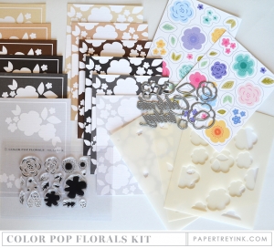
I really loved the geometric pattern on the walls.  If you look closely (click on the photo to make it large) you'll see the score lines I made to mimic that wall treatment.  It's a very subtle but I think it really adds a lot of depth to this card.  I decided to use PTI's Color Pop florals kit just as Carol did pulling the aqua mist and berry sorbet colors from the photo.  The pillow on the chair made me think of this kit.

I purchased some liquid leaf for PTI's Stamp-a-Faire (stay tuned I will be posting my projects from the event tonight) and I'm sooo glad I did!  I painted some of it on the thanks die cut and also dotted some of it on my flower centers using a stylus.  This stuff is gorgeous!  It dries almost instantly leaving behind a beautiful gold finish.  The picture doesn't do it justice.  I haven't used gold much in the past but I definitely will be using this more in the future.  A little goes a long way but it does smell similar to spray paint.  So you may want to open a window when using it!

Oh and I almost forgot I cut the thanks die cut from PTI's coasters.  This is a tip from SAF from design team member Danielle.  The coasters are cheap as you get 25 for $1.00 which will give you many die cuts.  They take up the gold leaf well and gives you the thickness similar to stacking 3 cardstock die cuts together.

I really struggled with what to use for my background with this card.  I cut the white panel using a rectangular stitching die and I knew I wanted the flowers and thanks die to over hang the white panel a bit.  I tried soft stone for the backing but there wasn't enough contrast between the white panel and the flowers.  So I pulled out some stormy sea from the 
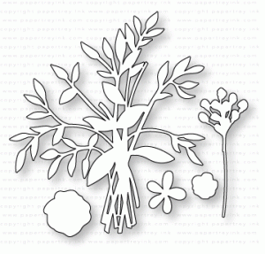
sampler pack.  I was convinced I didn't like this color when it was first introduced..figuring I had other grays i liked better.  But...WOW...that stormy sea paper really made my flowers pop!  I cut the foliage die from the friendship jar flowers in stormy sea too snipping it apart to layer beneath my flowers.  I love these colors together.  I guess stormy sea will now go on my wish list!

Supplies are listed and linked below:


Make It Market Mini Kit: Color Pop Florals

PTI Friendship Jar Flowers Dies

PTI Big Basics: Thanks Die

Clarity Stencil Brushes

PTI Melon Berry Dye Ink

PTI Aqua Mist Dye Ink
Thanks for stopping by! Please come back soon as I will have my projects from Stamp-a-Faire posted later tonight!
Share:

Thursday, July 14, 2016

Papertrey Ink Create Along With Us July 2016

This week is the new product release week at Papertrey Ink.  The designers have been busy getting samples made with the new products so they haven't had time to film any technique videos.  So this week we are to make a card using one of the design team's cards for inspiration.

I knew right away which card I would choose as my inspiration piece.

Isn't that card designed by Dawn McVey just gorgeous!  You can see more details about the card on Dawn's blog here.

I dug out some much neglected patterned paper from Chatterbox and got to work trimming.  I didn't have the die Dawn used but I did have an old Creative Memories wavy trimmer which helped to trim the patterned papers into that curvy wave shape.  I gotta tell ya it feels wonderful to dig out some old supplies and give them new life!  I cut the Hugs die out of white fun foam to give it more dimension. I combined two different stamp sets to get the sentiment I wanted.  The "sending you"  and "and" sentiments are from Hero Arts Prayers stamps and the actual word "Prayers" is from PTI's Painted Petals stamp set. A few iridescent sequins finishes the card.

Since I had to cut into a 12 x 12 paper to make the card...I decided to make a few more cards.

I needed a bunch of thank you cards to send out.  However, my PTI "Thanks" was too large for this card design.  I remember Jennifer McGuire doing a video where she used the heat gun to shrink the fun foam so I did just that.  You can find Jennifer's wonderful video here.
Check it out!  The top is the size of the original die cut.  The bottom is the shrunken fun foam.  I know it's not a huge difference but shrinking made the die cut the perfect size for this card.  I cut off the "s" so I could add the sentiment from PTI's The Skinny stamp set.  I also added some clear Wink of Stella glitter to the blue part of the flower.  Oh and the flower center is colored in with a Copic marker.

Supplies are listed and linked below:

PTI Quilted: Summer Stamp Set

PTI Quilted: Summer Die

PTI The Skinny Stamps

PTI Big Basics: Thanks Die 

PTI Big Hugs Die Set

  PTI Painted Petals Stamps

Hero Arts Exclusive PRAYERS

 Stamps and Dies Set

Momento Nautical Blue Dye Ink

White Fun Foam
Thanks for stopping by! Please come back again!
Share:

Sunday, July 10, 2016

Paper Trey Ink's Make it Monday #255: String Art Using Die Cuts

Amy has a wonderful video showing 3 ways to use string art on your cards using die cuts.  Check out the video HERE.

I used a PTI Woodblock Prints stencil and Clarity stencil brushes to apply my background pattern on pale peony cardstock.  I absolutely love these brushes!  They make it easy to apply ink to the stencil with no splotchiness and no foam getting stuck in the stencil to worry about.  I also love this new pale peony color by PTI.  It is a shade lighter than melon berry thus making it perfect for layering in these flowers from PTI's Graceful Greetings II.  I wrapped some gold thread around a scallop oval.  I added some gold glitter embossing powder to some of the stamped flowers.  I added one more gold element by using gold posterboard as my card base.  (Thanks to a good friend I have quite a bit of this to use...she mentioned you can get it really cheap sometimes at Hobby Lobby...a great alternative to expensive gold cardstock but still looks just as nice).   Isn't that big "Thanks" die just lovely.  I cut it in Berry Sorbet.  I love how the bold size makes it star of the card...conveying my thanks in a big way! Oh I almost  forgot I also added tiny dots of gold to the middle of each flower in my background paper using a Copic Twinkling Stars gold marker.  I hardly ever use metallics in my projects but I do love the royal look of gold.  I should use it more often!
Supplies listed and linked below:

PTI Graceful Greetings II Stamps

PTI Big Basics: Thanks Die

PTI Woodblock Prints Stencils

PTI Pale Peony Dye Ink

PTI Berry Sorbet Dye Ink

PTI Aqua Mist Dye Ink


Momento Pear Tart Dye Ink

Clarity Stencil Brushes

Wow Embossing Glitter Gold

PTI Hawaiian Shores Dye Ink

Metallic Gold Thread

Metallic Poster Board


Copic Gold Glitter Marker

Note: I couldn't find the exact items I used to link to for the gold embossing powder, poster board, and the gold thread so I linked to similar items.
Thanks for stopping by!  Please come back again!

Share: