This week's color Colour Q challenge is a great mix of colors that remind me of Spring.
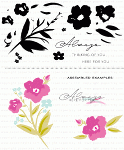
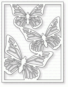
 It's nice to see colors like this in the Winter. When I think of Spring I think of butterflies. PTI just released this gorgeous butterfly cover plate and I couldn't wait to use it! One of PTI's talented designer's created an amazing card using this cover plate and I just knew her design would be perfect for these colors. You can see Laurie's beautiful card here.
Okay warning I loved using this coverplate so much I got kinda carried away! So you will see many variations below.

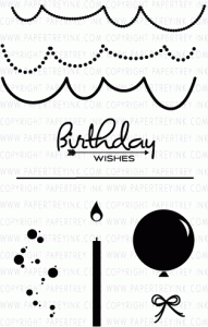
I hadn't played with my distress ink for a long while. I got the round blending tool and a pack of mini cubes from hubby and the kids for Christmas so I figured I'd pull them out. I love that little round blending tool! It's sooo much easier to blend then the rectangle one! The closest purple distress ink I had to wisteria wonder is shaded lilac so I used that in addition to mustard seed and peeled paint. I took a paintbrush and flicked on some white pearl shimmer mist to the background. A sentiment from PTI's wishes come true stamped on chocolate brown paper (sorry it looks black in the photo) then embossed with white embossing powder finishes the card.
Tip...clean off your mat in between inking colors. As you can see in my card I have numerous colors in the lilac ink because I didn't clean my mat! Oops! I do better in the next cards!
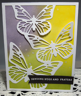 I didn't care for the bluish hue in the first card so I tried some plain old dye ink by PTI called winter wisteria along with the same distress ink colors in the first card. I liked this much better. I used plain water to spritz the background this time. I will say the distress ink was much easier to blend then the dye ink...not impossible but takes a little longer. Plus distress ink does react with the water better.
 I wanted to try an even more vibrant purple so I used dusty concord in addition to the other colors.
I also remembered I had some pearlized cardstock (woohoo using up my stash) so I cut the coverplate from that. I wish I would have thought about this before I cut several out of plain white cardstock. The finish is amazing! It's hard to see in the photo...take a look at the one on the bottom.
 Still more gorgeous in real life but you get the idea! Next, I thought I'd try an orange...
 So it was distress orange marmalade along with the others I previously used. Next I went with a total different rainbow to really brighten things up a bit.
 This time the following distress inks were used: abandoned coral, cracked pistachio and fossilized amber. Gold shimmer spray spritzed on the background this time.
As you can see I had way too much fun with ink and this butterfly cover plate. I did an experiment and cut cover plate out of good PTI card stock and then out of cheap Georgia Pacific card stock and really the thickness doesn't matter for these. The pearlized card stock is stunning but if you are looking to be frugal (who isn't?!) then the cheaper card will still give you good results! (I used the cheaper in all of these except for the shimmer) Plus this is a really flat card which is easy to mail. You don't need a lot of bumpy bling to make this one look good! Gotta love that! This is my first cover plate purchase (thanks to birthday money!) as I thought the cover plates were nice but expensive. However, I am glad I invested on this one because you can create a beautiful card with minimal layers in no time!
Supplies are listed and linked below:
Thanks for stopping by! Please come back again!

Okay warning I loved using this coverplate so much I got kinda carried away! So you will see many variations below.

I hadn't played with my distress ink for a long while. I got the round blending tool and a pack of mini cubes from hubby and the kids for Christmas so I figured I'd pull them out. I love that little round blending tool! It's sooo much easier to blend then the rectangle one! The closest purple distress ink I had to wisteria wonder is shaded lilac so I used that in addition to mustard seed and peeled paint. I took a paintbrush and flicked on some white pearl shimmer mist to the background. A sentiment from PTI's wishes come true stamped on chocolate brown paper (sorry it looks black in the photo) then embossed with white embossing powder finishes the card.
Tip...clean off your mat in between inking colors. As you can see in my card I have numerous colors in the lilac ink because I didn't clean my mat! Oops! I do better in the next cards!


I also remembered I had some pearlized cardstock (woohoo using up my stash) so I cut the coverplate from that. I wish I would have thought about this before I cut several out of plain white cardstock. The finish is amazing! It's hard to see in the photo...take a look at the one on the bottom.


As you can see I had way too much fun with ink and this butterfly cover plate. I did an experiment and cut cover plate out of good PTI card stock and then out of cheap Georgia Pacific card stock and really the thickness doesn't matter for these. The pearlized card stock is stunning but if you are looking to be frugal (who isn't?!) then the cheaper card will still give you good results! (I used the cheaper in all of these except for the shimmer) Plus this is a really flat card which is easy to mail. You don't need a lot of bumpy bling to make this one look good! Gotta love that! This is my first cover plate purchase (thanks to birthday money!) as I thought the cover plates were nice but expensive. However, I am glad I invested on this one because you can create a beautiful card with minimal layers in no time!
Supplies are listed and linked below:
 PTI Cover Plate: Butterfly Die |  PTI Wishes Come True Stamp Set |
 PTI Winter Wisteria Dye Ink |
 Mustard Seed Distress Ink |  Peeled Paint Distress Ink |
 Dusty Concord Distress Ink |
 Spiced Marmalade Distress Ink |  Cracked Pistachio Distress Ink |
 Abandoned Coral Distress Ink |
 Fossilized Amber Distress Ink |  Hero Arts Prayers Stamps |
PTI Round and Round Anniversary Set (no longer available) |
Thanks for stopping by! Please come back again!