Sunday, September 25, 2016

Papertrey Ink September 2016 Blog Hop Challenge

Today at Papertrey ink there is a blog hop going on.  We are to make a card with the above photo for inspiration.  You can check out all the wonderful cards at Nicole Heady's blog here.  As Nicole mentioned it's good when the artist keeps things simple and just sticks to the basics.  So I kept that in mind when making my card but I have to say It was very difficult for me to stop adding embellishments and such!

I also used a sketch by Amy Sheffer for inspiration.  It is from Papertrey Ink April 2016 newsletter.


I didn't have any pinecone stamps so I made due with flower stamps from PTI's Everyday Classics stamp set.  I used a white Prismacolor pencil to add the "snow" to the pinecones.  What do you think...do they look like pine cones to you?  In the sketch is says to add a variety of material to add interest and texture so I cut the tag out of burlap and the scalloped element out of felt.  I like how some of the leaves were overturned exposing the backside of the leaf in the photo.  So I cut the sprigs out of two shades of green and glued them together then I flipped some of the leaves over and glued down them down so the lighter side showed.  I colored the berries on the sprigs with a white gel pen.  A craft tag (cut using the QK special edition kit) and bow finishes the card.  I really struggled to stop here and keep things simple.  I really wanted to add some sequins or rainstones.

Supplies listed and linked below:

PTI Everyday Classics (2009 Anniversary Edition

PTI Bells and Boughs Stamp Set

PTI Tag Sale #10 Die

PTI Cocoa Bean Dye Ink

WPlus9 Under the Mistletoe Dies

White Gel Pen
Thanks for stopping by!  Enjoy the rest of your weekend!  Please come back again!


Share:

Saturday, September 17, 2016

Create Along With Us: September 2016 and Tutorial: Making smaller sequins

This is the week new products are released over at Papertrey Ink so instead of having a technique video challenge they give the designers a break and we simply choose one of their wonderful cards created during the release to mimic.

I immediately fell in love with Amy Sheffer's card below:
I love how she used the tag, holiday clusters and subtle ink blending on her card.  So I decided to make my own fall version.  See more info on her fabulous card on her blog by clicking here.

I combined several different stamp sets to make my floral arrangement.  The leaves were actually die cut from gold poster board a friend of mine generously sent me.  I don't often use gold..I don't know why because when I do guild it up I love the results!  I added some colored pencil shading blended out with gamsol to add depth to my stamped images.  I heat embossed the scripture sentiment with gold embossing powder.  I just love this sentiment..perfect for many situations!  I did some subtle ink blending in the background using a soft make up brush.  Ink spatters in watered down canyon clay add to the ink blending.  Look...look...I actually used an eyelet!  I have a ton of these lying around and was thrilled to use one.  Some gold and white fibers embellished the tag.  This is a large sized card 5" x 7" and I don't do well with white space so I hope it looks okay!  My elements just were too large to fit on a smaller card.

See those small gold sequins?  Well I made them so to speak...let me show you.

I used my Crop a Dile Big Bite to take a "bite" out of the large sequins to make them smaller.
I took a few photos to hopefully show you what I'm talking about.


Position your sequin on top of the specific sized hole you want your sequin to be centering it as best you can and press down the handle.  Viola!  You end up with a smaller sequin and a donut looking thing which would be good to save for shaker cards.   I do apologize I had the sequin on top of the smaller hole in the photo but I actually used the hole to the far left for my example sequins.  I was given a whole bunch of sequins from a lady who did sequined ornaments but I didn't have a variety of sizes so I was thrilled to find I can now make my own!

Supplies listed and linked below:

PTI Everyday Classics (2009 Anniversary Edition

PTI Floral Sketches Stamp Set

PTI Color Pop Autumn Mini Kit

PTI Canyon Clay Dye Ink

PTI Americana Dye Ink

Momento Pistachio Dye Ink


PTI New Every Morning Stamp Set

Brushed Corduroy Distress Ink

Inky Antics Gamsol Coloring Kit


PTI Fancy Foliage Details Dies

Thanks for stopping by! Please come back again!
Share:

Sunday, September 11, 2016

Papertrey Ink Make it Monday 260: From Black and White to Color

This week's Make it Monday over at Papertrey Ink involves using black and white plus colored images on one card.  Sound confusing?  Danielle has a wonderful video explaining exactly how to do this technique here.

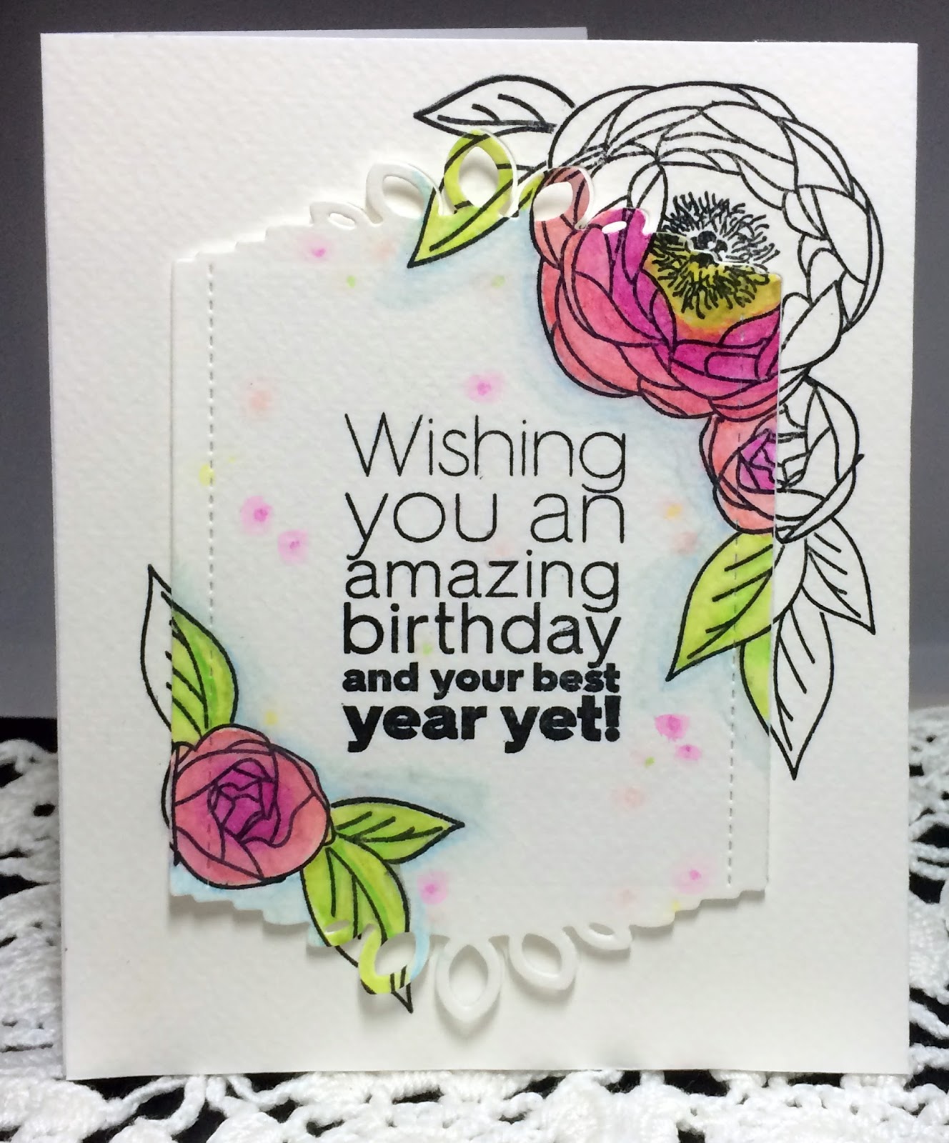
I wasn't sure I was going to make the deadline for this challenge.  Coloring for me can be quite time consuming...but since the whole image didn't need to be colored I made this card in record time!  I think using colored pencils gives more precise control of where color can be put down thus increasing speed too!  More about the pencils I used later in this post.

I hardly ever practice on scrap paper before starting my cards.  However, I wasn't sure how this technique would look with the products I wanted to use so I had to practice first.

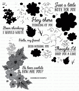
I thought I would share my practice sheet so you can see how I figure out how to layer my flowers.  I simply stamp my images overlapping then I roughly color each image in the order they get stamped in.  The top image...the one closest to you get stamped first.  So I lay this paper in my MISTI position the purple stamps upside down on top of the stamped practice sheet close the lid and viola they are in perfect placement for stamping on my card.  After stamping the purple images I apply masks over them and then position the brown #2 images in the same way....and so on.  I find this is the absolute best way to figure out how I want my stamps layered.

I used watercolor paper and some new 
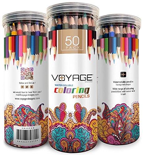
water soluble pencils I recently received to color in my images.  (I also put a blue shadow around the floral images and leaves too)  They are made by Voyage designs and on Amazon today they are about $8.00 for a pack of 50 and they even come in a plastic case with a screw on lid.  I have used water color pencils in the past and found it was very hard to blend out the pencil lines.  Normally I just use reinkers to watercolor but I love the precise control pencils gives so I was anxious to see how these would work.    I was super impressed!  When I added water the lines just melted away and the colors blended beautifully!  See for yourself..

You can click on the photo to make it larger.  My watercolor paper had texture to it so there were much white showing through after I had colored my image.  But once a little water was added..you can't even tell I started with a colored pencil.  My small flower in the left corner wasn't as vibrant as I liked so I used my heat gun to dry the image then colored right over the same place and added more water.  The paper accept the second layer of  color very well without any peeling or the paper whatsoever.    I did the coloring and painting in the water super fast...I bet I could get even better results if I took my time.  I can't wait to play with these pencils some more.  I do have a project in the works that shows how I used them to add depth and shading to my solid stamped images...so stay tuned for that.

Oh and another fun thing you can do with these pencils is draw in little dots of color then use the water to make halos of color around them.  It almost looks like little party lights or confetti in the background of my card.  Here is a close up so you can see what I mean
 
Supplies listed and linked below:

PTI Peonies on Parade Stamps

PTI Ombre Sentiments: Birthday

PTI Center Style: Feminine Die


Voyage Designs Water Soluble Color Pencils

Thanks for stopping by! Please stop back again!
Share:

Friday, September 02, 2016

Do you see the world in a Papertrey Ink Rainbow?

When you look through the projects on my blog...you definitely will see my love of Papertrey Ink products.   I think I have influenced my daughter to love their products too...I have a little story to tell about our sneaker buying experience.

So we were in the store a few weeks ago looking for back to school sneakers for my 9 year old daughter.  While browsing the shelves for shoes that didn't have pink in them...(she is anti-pink now..but last year it was her favorite color!)...she said something that made me laugh.  I don't remember her exact words but when she spotted the sneaker above she said something like Mom those sneakers have aqua mist shoelaces on them.  Aqua Mist is one of Papertrey ink's colors.  I was soo impressed that she made the connection between the PTI ink color I use and the shoelace color.  This isn't the first time she has done this sort of thing.  She has mentioned before..about this and that resembling other PTI colors when we are out and about.   She sees the world in a PTI rainbow!  Just to tell you where her priorities are..she knows all my ink color names but has yet to memorize her multiplication tables!  :)

I will be back soon with the lastest Make it Monday challenge at PTI so I'll see you soon!  Thanks for stopping by!  Enjoy your weekend! 


Share: